
How to Choose Bathroom Vanity Color: Expert Tips to Match Style, Lighting, and Size
Choosing the right bathroom vanity color is essential for enhancing your space’s overall feel. Lighter hues are ideal for small or narrow bathrooms, as they create an open atmosphere, while darker tones can anchor larger spaces or add an element of drama. To achieve a cohesive look, match the vanity color’s undertones with your countertops, tiles, and hardware. When selecting colors, consider the direction of natural light and the color rendering index (CRI) of your artificial lighting. Opt for durable finishes that are easy to maintain, and avoid overly trendy combinations. Always test paint samples in your bathroom’s lighting before making a final decision. Follow up for practical testing steps, layout strategies, and palette suggestions to find the perfect vanity color for your bathroom.
Choosing the Right Bathroom Vanity Color Quick Recommendation
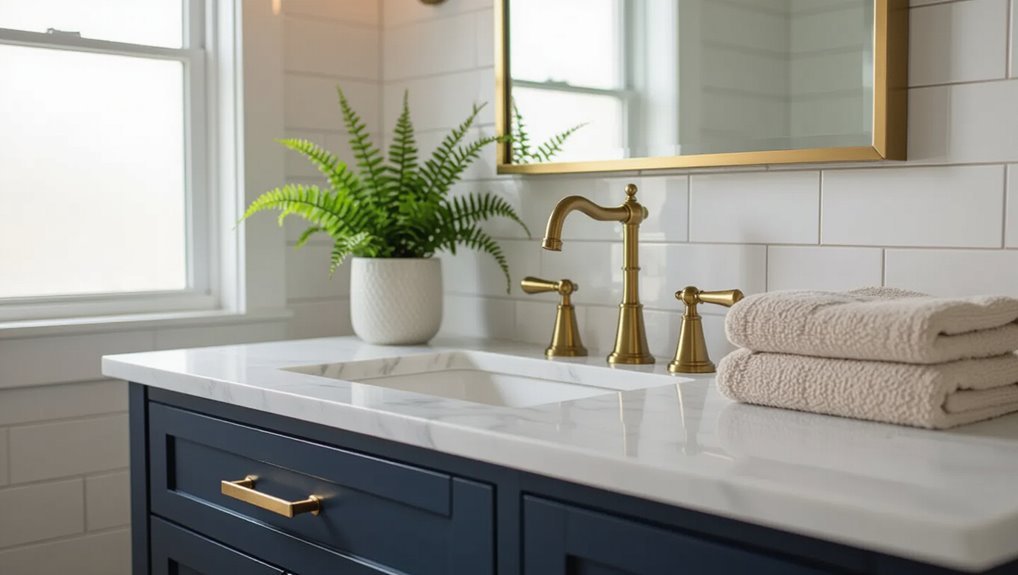
The article offers one-sentence color guidance tied to common bathroom goals—brighten, warm, or create contrast.
It also lists quick color picks by style: modern, traditional, farmhouse, and minimalist.
Readers are guided to match goals with a concise style-based recommendation.
One-sentence color guidance for common bathroom goals
A quick recommendation: match a white or light gray vanity to small or minimalist bathrooms for brightness.
For warmth, choose wood tones; for bold contrast, pick deep navy or charcoal; for a serene spa feel, select soft greens or muted blues; for high-contrast modern spaces, opt for black or matte finishes.
These concise cues help readers understand how to choose bathroom vanity color efficiently.
Fast picks by style: modern, traditional, farmhouse, minimalist
Color choices for vanities shift with style: modern spaces favor sleek neutrals like charcoal, navy, or matte black for contrast; traditional bathrooms suit warm creams, soft taupes, or rich wood stains; farmhouse designs work best with painted whites, distressed greys, or muted sage; minimalist rooms benefit from light grays or pure whites to maintain brightness and visual calm.
Select finishes, hardware, and accents to reinforce the chosen aesthetic.
Key Principles Behind Vanity Color Selection
Color choices influence how roomy a bathroom feels, with lighter hues generally opening space and darker tones adding visual weight.
Undertones and color temperature determine how a vanity reads against walls and lighting, affecting harmony or contrast.
Coordinating the vanity with existing fixtures and finishes guarantees a cohesive, intentional look.
How color affects perceived space and scale
Several hues alter the apparent dimensions of a bathroom by affecting light reflection, contrast, and visual weight.
Light, reflective colors expand space; deep, saturated tones recede or anchor areas depending on placement.
High-contrast cabinetry against walls emphasizes edges and can make rooms feel smaller.
Monochromatic or tonal schemes streamline perception, creating cohesion and the illusion of greater scale without altering actual dimensions.
The role of undertones and color temperature
While often subtle, undertones and color temperature decisively shape how a vanity reads within a bathroom’s palette and lighting, influencing harmony, contrast, and perceived warmth.
Cool undertones (blue, green) recede and feel crisp under cool light; warm undertones (yellow, red) advance and cozy under warm light.
Selecting a vanity hue requires matching undertone intent to the room’s lighting and desired atmosphere.
Coordinating with existing fixtures and finishes
A vanity’s finish must be chosen with reference to the bathroom’s existing fixtures and hardware to guarantee visual cohesion and functional compatibility.
Consider metal tones—chrome, brushed nickel, brass—and match or deliberately contrast them.
Coordinate with faucets, towel bars, lighting, and mirror frames.
Account for countertop and tile undertones to avoid clashes.
Consistent finishes create a unified, intentional design.
Assessing Your Bathroom Before Picking a Color
Before choosing a vanity color, one should measure the room and ceiling height to understand scale and proportion.
The assessment also looks at natural and artificial lighting and catalogs existing hues in walls, tiles, countertops, and hardware.
Finally, consideration of maintenance needs and wear patterns helps determine finishes and tones that will remain practical over time.
Measuring space and ceiling height for color decisions
Several key measurements—room floor area, fixture clearance, and ceiling height—determine how a vanity color will read in the space.
Measure floor square footage, door and walkway widths, and clearance around the vanity to guarantee proportions.
Record ceiling height to judge perceived scale: low ceilings favor lighter, low-contrast tones; tall ceilings tolerate deeper, more saturated colors without overwhelming the room.
Evaluating natural and artificial lighting
When evaluating lighting, note both the quantity and quality of natural and artificial sources because each alters how vanity colors appear at different times of day.
Observe sunlight direction, window size, and shading, then catalog fixture types, bulb warmth (Kelvin), and lumen output.
Test paint swatches under morning, midday, and evening conditions to predict undertones and contrast with surrounding finishes accurately.
Inventory of current colors: walls, tiles, countertops, hardware
How does the bathroom’s existing palette inform the vanity choice? A concise inventory catalogs wall paint, tile hues, countertop tones, and metal finishes.
Note dominant, secondary, and accent colors plus undertones and contrast levels. Match or purposely contrast with the vanity while considering cohesion with fixtures and trim.
Photograph and record samples for reference during selection and ordering.
Determining maintenance needs and wear patterns
Although often overlooked, evaluating maintenance demands and typical wear patterns is essential before choosing a vanity color.
The homeowner should note cleaning frequency, susceptibility to water stains, and how visible dust, soap scum, or scratches will be on different finishes.
High-traffic or moisture-prone bathrooms benefit from forgiving, low-maintenance hues and durable finishes that conceal wear and reduce upkeep.
Color Strategies Based on Bathroom Size and Layout
Room size and layout should guide vanity color choices to either visually expand or intentionally shorten a space.
In small bathrooms, light, reflective hues open the room while darker tones can create a cozier, compressed feel; narrow or long layouts benefit from mid-tone contrasts or horizontal accents to restore balance.
In large bathrooms, bold or dark vanities can anchor the space and introduce drama without overwhelming the proportions.
Small bathrooms: colors that expand vs. colors that shorten
Wanting a sense of space in a compact bathroom often starts with color choices that either visually expand or compress the area.
Light, cool hues—soft whites, pale blues, and muted greys—reflect light and create openness. High-contrast, dark tones or saturated colors make surfaces recede and can shorten perceived depth.
Gloss finishes amplify reflection; matte finishes absorb light, enhancing coziness.
Narrow or long layouts: best approaches for balance
When compact bathrooms benefit from light, cool hues, long or narrow layouts require a different, more directional approach to color.
Designers favor horizontal contrast to widen sightlines: darker cabinetry on far walls, lighter tones near entry, and mid-tone vanities with vertical accents to break length.
Strategic mirrors, continuous flooring, and coordinated trim unify space while preventing a tunnel effect.
Large bathrooms: when to use bold or dark vanities
Why choose a bold or dark vanity in a large bathroom? A deep or saturated vanity anchors expansive space, creating contrast and visual focus.
Dark finishes add warmth and luxury, especially against light walls or marble. Bold tones define zones, balance scale, and conceal wear.
Guarantee adequate lighting and reflective accents to prevent the room from feeling heavy or cavernous.
Matching Vanity Color to Lighting Conditions
Lighting direction and type greatly alter how vanity colors read, so selections should respond to north-facing cool light, south-facing warm light, and the variable tones of east- and west-facing exposures throughout the day.
North-facing bathrooms often benefit from warmer or richer color families to counteract blue light, while south-facing spaces can handle cooler or more subdued hues because of abundant warm sunlight.
Artificial lighting—LED, incandescent, warm or cool—further shifts perceived color temperature and finish, so fixture choice and bulb warmth must be considered alongside natural exposure.
North-facing light: ideal color families
Because north-facing light tends to be cool and consistent, it favors vanity colors that introduce warmth or muted depth to counterbalance blue undertones.
Recommended families include warm neutrals (creamy beiges, soft taupes), muted earthy greens, warm greys with brown undertones, and rich terracotta or ochre accents.
These choices add visual warmth and prevent spaces from feeling sterile or overly cool.
South-facing light: ideal color families
Sunlit rooms demand colors that balance warmth with freshness; south-facing light, with its strong, direct sunshine, enhances saturation and can make hues appear more vivid and warm.
Favor muted cools like soft gray-blues and sage to temper brightness, or choose warm neutrals—taupe, warm white, sunlit beige—to complement intensity.
Deep, saturated tones work if balanced with reflective surfaces and restrained accents.
East- and west-facing light: timing and tone considerations
Time-of-day shifts shape perception, so east- and west-facing bathrooms require vanity colors chosen for changing warmth and contrast.
Morning light from the east favors cooler neutrals and soft pastels that read warmer as daylight strengthens.
Evening west light deepens hues and boosts saturation, so mid-tone greys, muted blues, or warm woods maintain balance without appearing too stark or oversaturated at dusk.
Artificial lighting types (LED, incandescent, warm/cool) and their impact
Although artificial light lacks the gradual color shifts of daylight, its temperature and rendering dramatically alter how a vanity’s color is perceived.
LED, incandescent and halogen differ in warmth and CRI; warm bulbs deepen reds and browns, cool LEDs favor blues and grays.
High-CRI sources reproduce true tones, while mixed fixtures create uneven casts—test samples under designated fixtures before final selection.
Coordinating Vanity Color with Styles and Materials
Designers consider how vanity color complements a room’s style and materials, from sleek, matte palettes for modern and contemporary spaces to enduring neutrals for traditional bathrooms.
Farmhouse and rustic schemes favor warm, distressed finishes while minimalist and Scandinavian looks use muted, neutral tones.
Luxe and glamorous bathrooms often employ dark, high-contrast choices to emphasize texture and shine.
Modern and contemporary: palette and finish suggestions
When aiming for a modern or contemporary bathroom, the vanity’s color and finish should emphasize clean lines and material honesty. Neutral tones like matte whites, charcoal grays, and muted greiges work as foundational choices, while high-contrast blacks or deep navy provide striking focal points.
Satin or matte lacquer, textured wood veneers, and engineered stone countertops maintain restraint. Metallic accents in brushed nickel or matte brass add subtle warmth.
Traditional and classic: timeless color choices
A handful of enduring hues anchor traditional and classic bathroom vanities: cream, warm white, deep mahogany, and soft gray-green provide a sense of permanence and subtlety.
These tones pair with polished brass or oil-rubbed bronze hardware, marble or honed stone tops, and paneled cabinetry.
Balanced contrast, restrained trim, and mature lighting preserve elegance while maintaining warmth and visual longevity.
Farmhouse and rustic: warm and distressed options
Moving from the refined palettes of traditional baths, farmhouse and rustic vanities favor warmth, texture, and the lived-in look.
Colors trend toward warm whites, soft creams, muted sage, and earthy taupes. Distressed finishes, reclaimed wood stains, and rubbed edges enhance character.
Hardware in aged brass or oil-rubbed bronze complements tones, creating cozy, approachable spaces that prioritize authenticity over polish.
Minimalist and Scandinavian: neutral and muted palettes
Simplicity guides the minimalist and Scandinavian approach to vanity color, favoring neutral and muted palettes that emphasize light, space, and function over ornament.
Pale grays, soft beiges, off-whites, and pale wood tones create calm continuity with tiles and fixtures. Matte or subtle satin finishes reduce visual clutter.
Contrast is minimal; texture and clean lines provide interest while maintaining an uncluttered, airy bathroom aesthetic.
Luxe and glamorous: dark and high-contrast choices
Boldness defines the luxe and glamorous approach to vanity color, where deep hues and sharp contrasts create a sense of drama and refinement.
Designers favor ebony, navy, and emerald vanities paired with brass, gold, or chrome hardware. High-gloss finishes and marble or mirrored counters amplify luxury.
Strategic lighting, metallic accents, and rich textures guarantee the scheme feels intentional rather than heavy.
Pairing Vanity Color with Countertops, Backsplashes, and Flooring
Choosing a vanity color requires balancing matching and contrasting strategies to either blend finishes for a cohesive look or introduce contrast for visual interest.
Material-specific guidance—such as harmonizing vanity tones with the veins and undertones of granite, quartz, or marble—helps guarantee color cohesion.
Consider tile and backsplash patterns alongside flooring undertones to coordinate textures and hues without competing elements.
Matching vs. contrasting: when to use each approach
When deciding whether to match or contrast a vanity with countertops, backsplashes, and flooring, consider how cohesion or contrast will affect the room’s perceived size, focal points, and style.
Matching expands small spaces and creates calm continuity; contrasting adds drama, defines the vanity as a focal point, and highlights texture.
Choose matching for minimalist or compact bathrooms, contrast for layered, eclectic, or statement-driven designs.
Granite, quartz, marble: color harmony guidelines
Balance color, veining, and undertone to create harmony between a vanity and stone surfaces like granite, quartz, or marble.
Choose a vanity hue that complements dominant stone tones; echo subtle veining with trim or accessories.
For dramatic stones, opt for subdued cabinetry; for neutral slabs, introduce muted color for warmth.
Consider flooring undertones to maintain cohesive shifts.
Tile and backsplash patterns: coordinating without clashing
After selecting a vanity color that harmonizes with the stone’s tones and veining, attention shifts to tile and backsplash patterns to guarantee the overall scheme reads as cohesive rather than competing.
Choose scale and rhythm that complement cabinet lines; limit dominant colors to one or two; echo subtle grout or accent hues from the vanity; balance texture with smooth surfaces to prevent visual clutter.
Flooring undertones and continuity strategies
While vanity color anchors a bathroom’s palette, flooring undertones determine how that anchor reads across the room, linking countertops and backsplashes to create visual continuity.
Select floors with warm, cool, or neutral undertones that echo countertop veining or backsplash hues.
Use connecting rugs, grout color, or trim to bridge contrasts, ensuring cohesive flow without forcing exact matches.
Finish, Texture, and Material Considerations
Finish and texture influence both appearance and maintenance: matte, satin, and gloss sheens each conceal or highlight imperfections and respond differently to cleaning.
Choices between stained wood and painted surfaces affect warmth, color fidelity, and the need for touch-ups.
Protective coatings and moisture-resistant materials determine long-term durability in a humid bathroom environment.
Matte, satin, gloss visual and practical effects
Though often overlooked, the choice between matte, satin, and gloss finishes profoundly affects a vanity’s appearance and performance:
Matte absorbs light, hiding imperfections and offering a modern, subdued look but resists wipe-clean sheen.
Satin balances soft reflection with durability, forgiving wear while easing maintenance.
Gloss maximizes reflectivity, enlarging small spaces and easing cleaning, yet highlights flaws and water spots more readily.
Wood stains and painted finishes: pros and cons
After selecting sheen, attention turns to whether the vanity should showcase natural wood or a painted surface: stains enhance grain and warmth, while paint offers uniform color and greater stylistic flexibility.
Stains reveal texture and age gracefully but limit color range; painted finishes permit bold hues and easier color matching but can obscure natural character and require careful prep to avoid visible brushwork or uneven coverage.
Durable coatings and moisture resistance
Consideration of durable coatings and moisture resistance is essential when choosing a bathroom vanity, since constant humidity and occasional splashes accelerate wear and promote swelling, peeling, or mold on vulnerable surfaces.
Options include water-resistant finishes (polyurethane, marine varnish), sealed veneers, and moisture-stable engineered woods.
Textured or matte coatings conceal wear; regular sealing and proper ventilation extend lifespan and preserve color fidelity.
Color Palettes and Specific Color Recommendations
The article outlines three practical palette directions for bathroom vanities.
Neutral options—whites, beiges, and greys—are described with attention to common undertones and their effect on room warmth.
It then contrasts popular bold choices like navy, forest green, and charcoal with trend-forward hues such as pastels, warm terracotta, and muted blues, offering brief usage tips for each.
Neutral palettes: whites, beiges, greys and their undertones
Neutral palettes—whites, beiges, and greys—serve as the foundation for versatile bathroom vanities, with undertones that determine whether a space reads warm, cool, or crisp.
Subtle shifts affect coordination with tile, metal, and lighting.
- Cool greys: blue or green undertones for modern, airy feels.
- Warm beiges: yellow or pink undertones for cozy warmth.
- True whites: neutral bases that reflect light evenly.
Popular bold colors: navy, forest green, charcoal and usage tips
While neutrals create a flexible backdrop, bolder hues like navy, forest green, and charcoal introduce depth and personality to bathroom vanities.
These tones anchor a room, conceal wear, and pair with metallic hardware. Consider lighting and tile contrast for balance.
- Navy: pairs with brass and warm woods.
- Forest green: complements marble and matte black.
- Charcoal: suits high-contrast white fixtures.
Trend-forward hues: pastels, warm terracotta, muted blues
Several fresh palettes — soft pastels, warm terracotta, and muted blues — steer contemporary bathroom vanities toward a modern, approachable aesthetic.
Thoughtful pairing balances mood and light, creating calm or earthy warmth. Recommendations include:
- Soft pastels: mint, blush, powder blue for airy, reflective spaces.
- Warm terracotta: clay and sienna for grounded, textured warmth.
- Muted blues: slate and dusty navy for serene, sophisticated contrast.
Sample Scenarios and Color Solutions
The article presents targeted color plans for three common situations: a small powder room with limited natural light, a master bathroom featuring a skylight and marble surfaces, and a rental bathroom with mixed hardware finishes.
Each scenario outlines practical vanity color choices that respond to lighting, surface materials, and longevity needs.
Readers will see clear solutions aimed at optimizing appearance and durability for each context.
Small powder room with low light color plan
When natural light is limited, choosing a vanity color for a small powder room requires balancing reflectivity and depth to prevent the space from feeling dim or cramped. Pale, warm neutrals and soft pastels amplify light, while carefully placed darker accents can add contrast without overwhelming the room.
Opt for satin finishes, mirror-backed fixtures, and trim in a slightly deeper tone to define form while preserving brightness.
Master bathroom with skylight and marble color plan
Moving from a compact, low‑light powder room to a master bathroom with a skylight and marble anchors a different set of priorities: abundant natural light allows for richer color decisions that respond to veining, undertones, and material reflectivity.
The vanity can be bold—deep navy, charcoal, or forest green—paired with warm metallic hardware.
Keep grout, trim, and countertop tones cohesive to highlight marble’s pattern.
Rental bathroom with mixed hardware finishes color plan
Although a landlord may inherit mismatched taps and towel bars, a cohesive color plan can unify mixed metal hardware without costly replacements.
Opt for a neutral vanity—soft gray, warm beige, or muted navy—to bridge chrome, brass, and matte black.
Coordinate grout, countertop, and accessory tones; introduce small accents echoing each finish.
This balanced palette conceals inconsistency and feels intentional to tenants.
Common Mistakes and How to Avoid Them
Common errors include overlooking undertones and the way light alters color, which can make a chosen shade read differently in the finished room.
Another frequent mistake is matching every element to one color or chasing fast-moving trends instead of selecting a durable, cohesive palette.
Testing samples in the actual bathroom under various lighting conditions prevents costly regrets.
Ignoring undertones and lighting effects
When undertones and lighting are overlooked, a vanity’s painted or stained color can read very differently than expected once installed. Cool fluorescent light can make warm creams look greenish, while warm incandescent bulbs can deepen cool grays into muddy taupes.
Designers recommend testing samples under actual bathroom lighting, observing at different times of day, and considering fixture temperature to guarantee undertones harmonize with tiles, countertops, and skin tones.
Overmatching everything to one color
If every surface in a bathroom is tied to a single color, the result can feel flat and visually confusing rather than cohesive. Relying solely on one hue eliminates contrast, obscures architectural details, and makes scale ambiguous.
Introduce complementary tones, textures, or metallic accents to create focus and depth. Balanced variation preserves harmony while preventing monotony and visual fatigue.
Choosing trends over longevity
After steering clear of an overly uniform palette, attention often shifts toward the latest color trends—an appealing but sometimes short-lived choice.
Designers caution against picking vanities solely for trendiness; faddish hues can date a space and complicate resale. Instead, prioritize enduring palettes, subtle accents, and versatile neutrals that adapt to evolving decor, ensuring longevity while allowing occasional, replaceable trendy touches.
Skimping on sample testing
Color samples serve as a small but essential insurance policy against costly mistakes.
Skipping samples risks unexpected undertones, misleading finishes, and poor light interaction.
Professionals recommend testing paint or material swatches in various lighting, on actual cabinet surfaces, and over several days.
Small trials reveal true color behavior, ensuring confident selection and avoiding expensive repainting or replacement later.
Practical Steps to Finalize Your Vanity Color
Practical steps help translate color ideas into reliable choices through hands-on testing and visual planning.
Sample paints and stains should be applied in-situ and observed at different times of day while mood boards or digital mockups compare options against existing fixtures or planned replacements.
A designer or color specialist can be consulted when decisions stall or when coordinating complex finishes is required.
How to test paint and stain samples in-situ
How should one verify a vanity finish under real conditions?
One applies multiple paint and stain samples directly to a hidden cabinet area or on large swatches placed near the vanity.
Observe samples at different times and under task, ambient, and natural light.
Note sheen, undertones, and how moisture affects color.
Photograph for comparison and allow samples to cure before final decisions.
Creating mood boards and digital mockups
Begin assembling visual references and layout options to translate sample observations into a cohesive design direction.
The designer compiles photos, swatches, lighting tests, and finish samples into a mood board, emphasizing color relationships, textures, and focal points.
Digital mockups place proposed vanity colors within photographed bathroom scenes to verify contrast, harmony, and perceived scale before final selection and ordering.
Working with existing fixtures or planning replacements
When evaluating vanity color choices in the context of existing fixtures or planned replacements, the designer first inventories fixed elements—plumbing hardware, lighting, mirrors, and tile—to determine which pieces must coordinate and which can be changed.
This inventory clarifies constraints such as metal finishes, warm or cool light temperatures, and visual weight so that color decisions align with functional realities and budgetary limits.
Then prioritize replacements, sample finishes, and confirm maintenance needs.
When to consult a designer or color specialist
Who should be consulted and at which stage depends on project complexity and the homeowner’s confidence with color decisions.
A designer or color specialist is advisable for large renovations, uncommon lighting, or when coordinating multiple finishes. They provide palette validation, sample placement, and lighting tests.
For simple updates, brief consultations or online color services may suffice to avoid costly mistakes and guarantee cohesive results.
Maintenance and Long-Term Considerations
Maintenance needs vary by finish, so straightforward cleaning routines and minor touch-up techniques should be matched to the chosen surface.
Color choices also influence resale appeal and staging strategies, with neutral or on-trend hues often easing marketability.
When wear appears, options like targeted repairs or a fresh coat of paint can renew a vanity without full replacement.
Cleaning and touch-up tips by finish
Different vanity finishes demand specific cleaning methods and touch-up approaches to preserve appearance and longevity.
For painted surfaces, use mild detergent, avoid abrasives, and touch up with matching paint.
Stained wood benefits from gentle wood cleaner and occasional oil; repair scratches with stain markers.
Laminates and veneers clean with nonabrasive cloths and edge-sealant repairs.
Metal finishes require appropriate polish and corrosion prevention.
How color affects resale value and staging
Because color choices shape first impressions and perceived value, they play a measurable role in resale prospects and staging effectiveness.
Neutral, timeless vanity colors broaden appeal and help buyers visualize personal touches, while bold or trendy hues can highlight design but risk narrowing market interest.
Strategic contrast, coordinated hardware, and consistency with overall palette enhance photographed listings and in-person showings, improving perceived quality and saleability.
Refreshing or repainting a vanity without full replacement
Staying within a resale-friendly palette does not require replacing a vanity to refresh a bathroom’s look; repainting or refinishing offers a cost-effective way to update color, repair wear, and maintain market appeal. Options should prioritize durability, neutral appeal, and coordination with fixtures.
- Use bonding primer and semi-gloss paint for longevity.
- Consider gentle hardware upgrades to modernize style.
- Match tones to lighting and tile for cohesion.
Visual Inspiration and Resources
A curated gallery of color combinations, from classic contrasts to modern monochromes, helps readers imagine effective pairings for different bathroom styles.
Practical recommendations on paint brands, wood stains, and coordinating hardware finishes provide reliable product starting points.
Hands-on tools and apps for previewing color changes offer quick, low-risk ways to test ideas before committing.
Color combinations gallery ideas
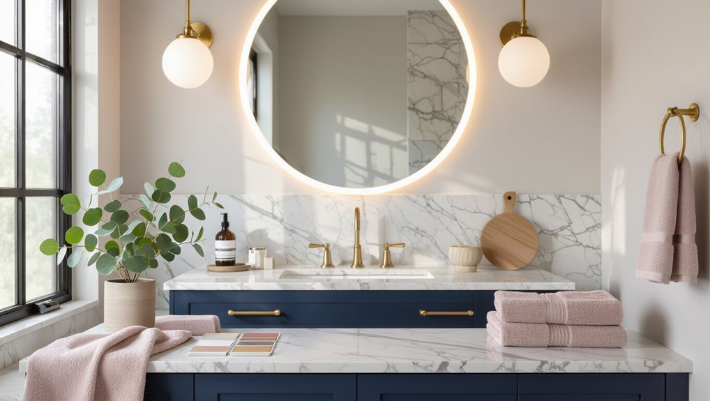
Many homeowners find quick clarity by browsing curated galleries that pair vanities with wall, floor, and hardware finishes. These visual collections demonstrate how contrast, tone-on-tone schemes, and unexpected accents function in real spaces.
Galleries organized by style, size, and light reveal successful palettes: crisp whites with warm wood, deep blues with brass, soft greys with matte black, and playful pastels paired with neutral stone.
Recommended paint brands, stains, and hardware finishes
Product choices anchor a successful vanity palette: reputable paint brands, durable stains, and well-matched hardware finishes determine longevity, color fidelity, and overall cohesion.
Recommendations emphasize quality, finish, and maintenance; sample first, prioritize low-VOC paints and water-resistant stains, and select hardware finish to unify fixtures and accents.
- Benjamin Moore/ECOS for reliable color and low VOC
- Water-based stains for even, durable tones
- Brushed nickel, matte black, or aged brass for cohesive hardware
Tools and apps for visualizing vanity color changes
How can homeowners preview vanity color changes without committing to paint or stain?
Digital tools and apps offer realistic mockups, augmented reality previews, and palette suggestions to test hues under simulated lighting.
Recommended options include easy room-scanning apps, manufacturer visualizers, and color-matching tools that export swatches for samples.
- AR room visualization apps
- Brand configurators/visualizers
- Color-matching/scanner tools
Conclusion
In closing, the careful chooser glides between choices, combining color, contrast, and context to craft calm corners or bold baths. Observant owners weigh waning light, wall tones, and spatial scale, selecting shades that sing or soothe. Practical pairing, persistent planning, and polished panache prevent pitfalls. With measured maintenance and mindful matching, the vanity becomes a vivid vignette—an anchor of aesthetic and agency that balances beauty, brightness, and usability in every bathing bay.